Online Restaurant Design journey
Goal
To design a solution (“FlavorFusion hub“) that seamlessly integrates both fast food and traditional meal options within a single website, streamlining the ordering process and enhancing an overall customer positive experience.
Point of View (POV) Statement
“Many customers face the inconvenience of having to order both fast foods and traditional meals from multiple restaurants, leading to a fragmented and time-consuming experience. The lack of unified platform catering to diverse culinary preferences results in inefficiency, increased effort, and a suboptimal user experience.”
Design Process
Interaction Design
Wireframes
Low & Mid Fidelity Prototypes
User Interface Design
Branding
Usability Testing
High Fidelity Prototypes
Usability Testing
Remote Testing
In-Person Prototype Testing
Overview
Steak Shack’s aim is to make available to its customers both take-away and traditional meals (i.e. FusionFlavor Hub) at affordable prices via their new website. They want to create an effective but simplified engagement by having a website in place where customers not only order their meals , still be able to book eat-in’s plus also book event catering.
Hopefully, the idea is after a year’s trial to develop an app that can embed other third party applications e.g. delivery to different locations, customized menu orders etc.
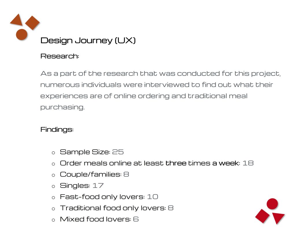
Research & Interviews
The goal of the project research was/is to understand how Steak Shack – Take Out can increase its numbers of users via its website “FusionFlavor hub” (traditional and fast-foods) functionality. In addition, to explore the current experiences of ordering meals by phone/online (i.e. via restaurant third party apps such as UberEats and DoorDash) ordering and face-to-face was/is like for customers and how their current experiences can be improved and showcased via Steak Shack Take Out’s dedicated website.
Furthermore, secondary research was conducted based on direct and indirect competitors like McDonald’s, Popeyes, Burger King and Chick-fil-A. All workarounds were researched along with participant interviews. Data results from the interviews, research and surveys have been used to better inform on understanding why users may not use as a ‘first go-to’ restaurant site to purchase their takeaway-eat-meals and what can be done to better encourage customers (UberEats and DoorDash) to use this website.
Research Procedure
The primary and secondary research resulted the creation of two personas:

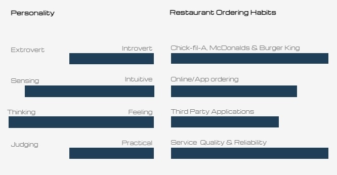
Persona 1: James Owen, a graphics designer (22)
Age bracket: 15 – 24 (13.0% of USA population)
Town: Coconut Creek FL.
Profile: James really enjoys his profession and spends a lot of his spare time on working on corporate projects. He uses online ordering frequency for his meals as he spends most of his time working from home.
Frustrations/Fears: James would like to be able to also order home-made cooked meals; as he mentioned “I do get a bit tired only able to order fried (fries and burgers) foods online, plus there is not really much to choose from, the variety of grilled foods is very limited. At times I have to order from two different eat-outs to avoid having just chicken, fries and onion rings, as there really is no other way to get a healthy variety from one place, unless if I order by phone to pick up!”
“For the type of meals that I would really like explore, their restaurants tend not to have a website. I usually have to order from third party apps such as Uber Eats and DoorDash, which only really provide discounts as allocated to the individual app promotions as to individual restaurant deals.”
“Although third party apps give some access to traditional meals, the costs in term of taxes, handling and other charges brings the prices of food to another unreasonable level, making it better if I buy in-person which I really don’t have enough time to do so.”
“At times there can be long queues of people (especially at peak lunch and dinner times), which I would rather like to avoid all together.”
Goals/Needs: “It would be nice to get other types of traditional meals including those like rib meals – gourmet meals, you know what I mean? without having to drive all the way to a restaurant.”
MOTIVATIONS
Variety & Options – Ability to explore a showcase of restaurant different types of foods without the need to visit multiple places.
Contactless Transactions – A preference of contactless transactions when ordering and paying for meals online from the comfort of his stationary work mode.
Availability & Affordability – Order a variety of meals directly from one and the same restaurant without incurring unnecessary charges.
Time Efficiency – An appreciation for time saved by avoiding queues or lengthy phone calls, making the online ordering process more efficient for his busy everyday work schedule.
Personality
Restaurant Ordering Habits
Extrovert
Introvert
Chick-fil-A, McDonalds & Burger King
Sensing
Intuitive
Online/App ordering
Thinking
Feeling
Third Party Applications
Judging
Practical
Service Quality & Reliability

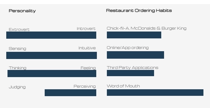
Persona 2: LeKai Johnson, a nursing student (30)
Age bracket: 25 – 54 (39.0% of USA population)
Town: Coral Springs FL.
Profile: LeKai is married to Luke (35, and a bank manager) with two children under the age of 10. She used to be a school teacher but recently had a career change and has embarked upon a degree in nursing. She plans to later on specialize in Pediatric Nursing really. In addition to her studies she also works part-time in a care home for children with special needs, she is practically busy all of the time.
Frustrations/Fears: During LeKai’s family free time, they love to just’ hangout’ (as she puts it) by the television and watch a stream of their favorite /newly released movie. She quickly adds:
“As we don’t really get that much time to be together as a family; between school runs and late night duties, when we do get the chance we really don’t like to cook. Grabbing something quickly to eat that caters to Mark’s along with the kids taste and mine is quite a problem, ’cause we end up having to go out to pick it up! “
“Both my husband I tend to use uberEats alot, but recently we noticed that the costs can be quite high; from tips, tax, handling and God knows what else. Suddenly, an affordable nice Chinese meal ends up running into quite a bit of money!”
Goals/Needs: “It would be great if we can get a nice family meal or just a light side meal ; ribs, just anything but fried fast-food made up of just chicken and fries all the time , a quick healthy meal.”
“My family would love to be able to explore and mix-and-match a range of quality foods directly from a restaurant website/app at affordable prices.”
MOTIVATIONS
Variety & Options – Ability to explore a showcase of restaurant different types of foods that caters for both children finger foods and adults, without the need to visit multiple places.
Also, a restaurant that caters for children’s adult trial size foods as a transition.
Contactless Transactions – traditional meals payable via quick and smooth contactless ordering.
Variety & Options – Ability to explore a showcase of restaurant different types of foods without the need to visit multiple places.
Availability & Affordability – Order a variety of meals directly from one and the same restaurant without incurring unnecessary charges.
Personality
Restaurant Ordering Habits
Extrovert
Introvert
Chick-fil-A, McDonalds & Burger King
Sensing
Intuitive
Online/App ordering
Thinking
Feeling
Third Party Applications
Judging
Perceiving
Word of Mouth
The creative combination of both persona’s (one and two), has given rise to a clear starting point and overall structure which is now the basis of the restaurants’ customer journey map.
Both the persona and customer journey map helped me to further outline and understand the user’s motivation one & two to order their meals via Stake Shack – Take Out website. Also, it validates the initial assumption that users are more likely to want to order food via a restaurant’s website/app – when there is a balanced range /mix of traditional and fast-food.
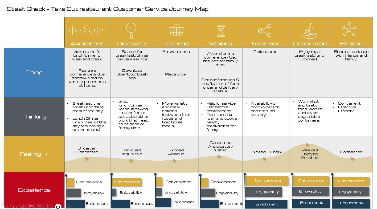

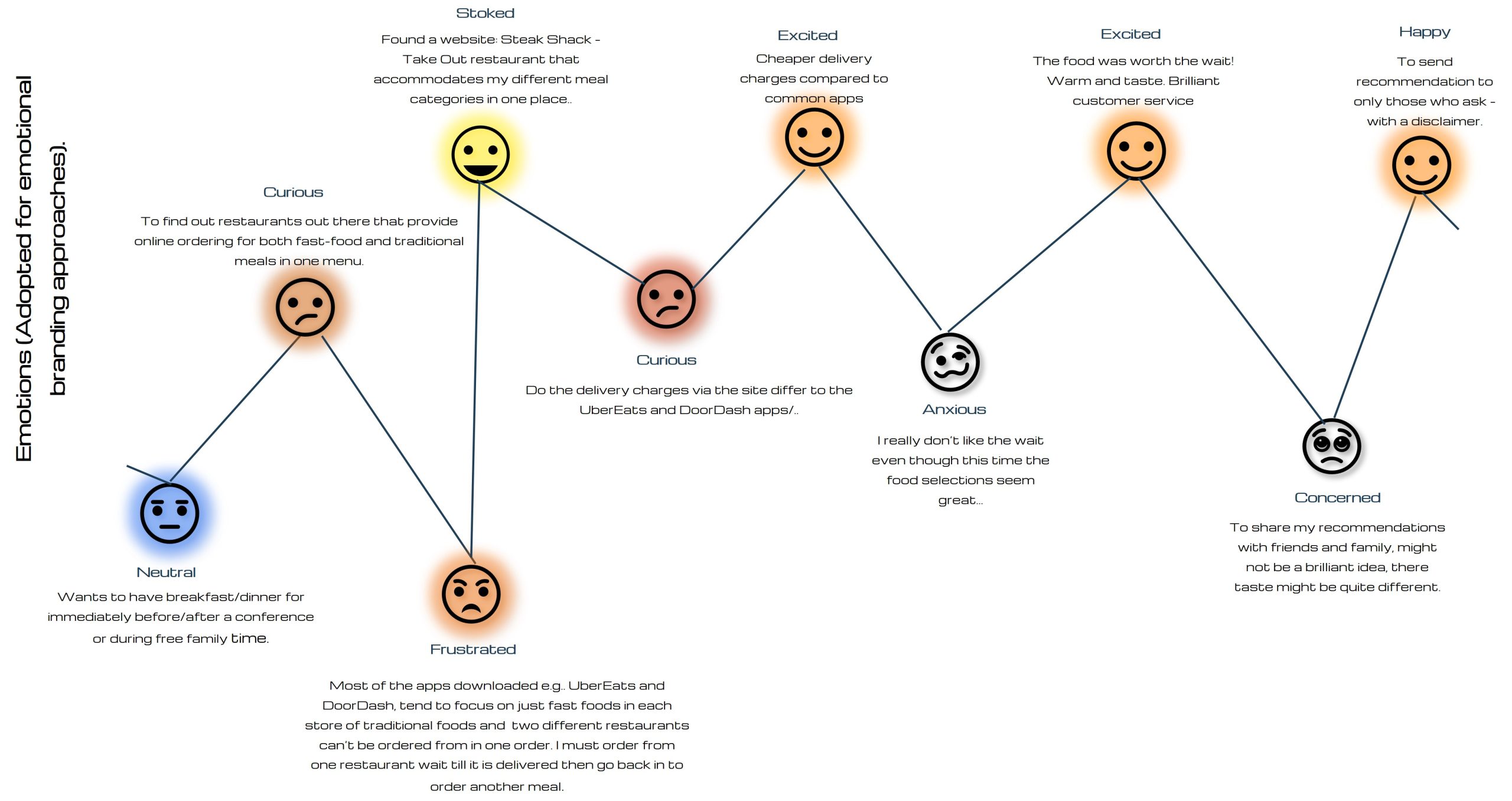
The results from the customer journey map, research and surveys have been used to better inform on how to effectively incorporate highlighted elements into the “FusionFlavor hub’ design process, what encourages users to purchase more meals at Steak Shack – Take Out Restaurant and how to increase the “FusionFlavor hub” functionality’s visibility.
One of the highlights of the pain points discovered during the research stage was that the participants were concerned about not having a good taste when it came to introducing other to their regular and favorite choice of meals. Henceforth, the adopted way for them is to simply stay connected the the “FusionFlavor” but not necessarily recommend specific or individual meals based on their personal choices.
Target Audience Interview
In this particular case study (Steak Shack – Take Out), as it is a new restaurant, the analysis has been based on users experiences with existing competitors , e.g. direct and (online/app), providing a clear insight into what really needs to be implemented in terms of the new ‘FlavorFusion hub’ aspect within Steak Shack – Take Out’s restaurant.
Competitor Analysis
In this particular case study (Steak Shack – Take Out), as it is a new restaurant, the analysis has been based on users experiences with existing competitors , e.g. direct and (online/app), providing a clear insight into what really needs to be implemented in terms of the new ‘FlavorFusion hub’ aspect within Steak Shack – Take Out’s restaurant.
Information Architecture
Understanding how the ‘FlavorFusion hub’ functions and prioritizes its service, is in the provision of mixed range of meals (from traditional to fast-food meals). In highlighting how customers can/best connect has led to a few ideas, incorporating the Design thinking Ideation process focusing on: Empathise, Define, Ideate, Prototype and Validate.
A series of mock ups were done followed by Low Fidelity User Testing to validate the user flow.
Mockups were drawn out, 2 user flows were created to depict how a user would potentially have access to each of the categories of meals (FlavorFusion) types of food within the ‘FusionFlavor’ aspect within Steak Shack – Take Out restaurant website.
Ideation
For the purpose of ideation, I decided to make use of ‘brainstorming’ , ‘sketching’ and ’empathy’, approaches that can best provide a holistic view of both ‘feelings’ and ‘thoughts’ of users when engaged on competitor sites including the that of ‘Steak Shack – Take Out’ prototype design.
Ideation approaches adopted and feedback generated has/will continue to bridge the gap between the identified user problems (i.e. a, b & c), identifying and putting in place overall design usability solutions.
User Flows
User Flows were adopted to clearly outline the strategy for the design of ‘Steak Shack – Take Out’ online ordering system., sharing an understanding of its design objectives and user pathways.
EXPLORE ¤ EXPAND ¤ CREATIVE DESIGN
©2025 Copyright | Last Updated: January 6, 2025 | Tabitha O. Abiola @tabitha-abiola.wiki for Personal Projects & Informative Purposes
